Want a brand that's catnip for your ideal client but not sure where to start? Get my 3 Pillars of Branding Workbook.

PROJECT OVERVIEW
CLIENT BIO
Birgitta Hughes is a homeopathic practitioner who is passionate about helping families find remedies through this natural wellness practice.
VIBE
Joyful, serene, natural, elegant, confident, soothing
GOALS
A beautiful logo integrated with other features online and in print. Simple. Elegant. Articulate and useful content. A website that is easy to navigate.
DELIVERABLES
-
Brand strategy Document
-
Position statement
-
Moodboard
-
Color Palette
-
Font selection
-
Logo and submark
-
Patterns
-
Business cards and stationary
-
Final Brand Guide
-
Copywriting
-
Website Design
-
SEO

The backstory
Birgitta came to me fairly early in her business journey, but she was clear on the value of branding and a strategic website. She wanted to do it right from the beginning.
She is passionate about what she does and I learned so much about homeopathy during our time together. I appreciated her eye for detail, her knowledge and her commitment to her brand.
Bring on the transformation ...
BRANDING

Style Inspiration

The Process
Target Market: Birgitta’s target market is a middle-income to high income woman who is the mother of school-aged children. She values critical thinking, loves nature, has questions about our health care systems and is looking for help with acute or chronic illnesses. She may be feeling discouraged with the promise of what is already available and is looking for a more natural but gentle approach.
Birgitta’s core messages: That there is another way that is effective. Your body is able to heal itself but sometimes needs a gentle budget. Homeopathy is a science-backed and well studied practice. There is hope for what your family is facing.
About her moodboard, she said, “There's a strong yet serene energy. It's dynamic yet soothing feel and I imagine it giving people a sense of awe at the idea of healing yet calm about the gentle yet effective healing of the tiny, sweet pellets.
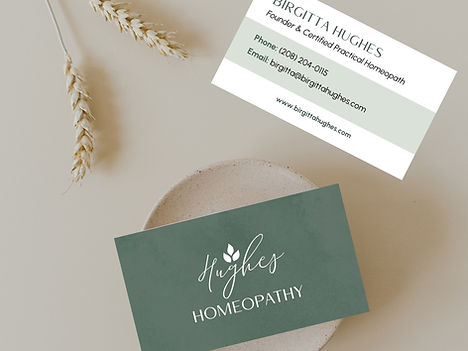
For her logo, I paired an elegant script font for her name, which felt natural and personal, with a stronger all-caps “Homeopathy” to contrast and serve as a foundation for the logo. I paired it with a set of leaves from the herb Belladonna, which is a plant used in homeopathy as a natural remedy.
I created a more detailed illustration of the belladonna plant for a pattern I created as well.
The overall feeling was a brand that feels grounded in nature, yet relatable and soothing.

Logo

Brand guide

Typography

Business Cards
WEBSITE
The Process
The key goals we had for Birgitta’s site is for people to join her email list, sign up for a group study program or book a consultation. These main goals touched people at various levels of acquainting with her business.
I designed her site around her brand while bringing in her a personal and casual touch with her branding photos of Birgitta herself. We also brought in elements that hint to the scientist and research that forms the basis for homeopathy.
It was also a key goal to help people easily take the steps we had as one of our three goals. One of the biggest challenges was to clearly explain homeopathy so that people understood the distinctions between it and other modalities, without getting into the weeds.
Within a week of launching her website, she booked a new client, had a new lead reach out, and had someone sign up for her group class.


Key Results
-
A new client and inquiry within a week of launching her site.
-
A brand that gave her more confidence and credibility in a field that can raise skepticism
-
A new sign up for her group program within the same week.
-
Lots of good feedback from those who viewed it.
Client Feedback

"I love my brand"
I love my brand. I appreciate your help and the seamless process.
I just received my first set of cards and stationery. They are beautiful.
I'm excited about the site and thankful for the very kind feedback I've received about it so far.
Birtigga Hughes, Hughes Homeopathy


